


Understanding your taste for color
How “color levers” can help you pinpoint what you like and don’t.

This is the second installment of my personal philosophies on wearing color. Read the first one here.
I studied drawing and painting for many years growing up, which has strongly influenced how I perceive and interact with color. If I had to sort myself into a painting style, it would probably be impressionism. I paint the colors I see or feel are present, not what I know is supposed to be there. My color perceptions are fluid, relative, and personal, varying with the time of day, weather, or even mood.
Colors in clothing are similarly dynamic. Color is not a binary in my style (I don’t believe in blanket statements like “Red doesn’t work for me”). The way I see it, wearing color “better”—often, and with joy—starts with understanding that colors, like ourselves, contain multitudes. And the more you’re able to notice what you specifically like (or don’t) about how color is working in a piece, the easier it will be to find and wear more colorful clothing that feels great to you.

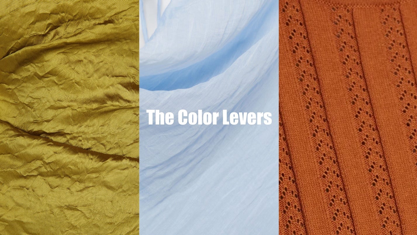
The Color Levers
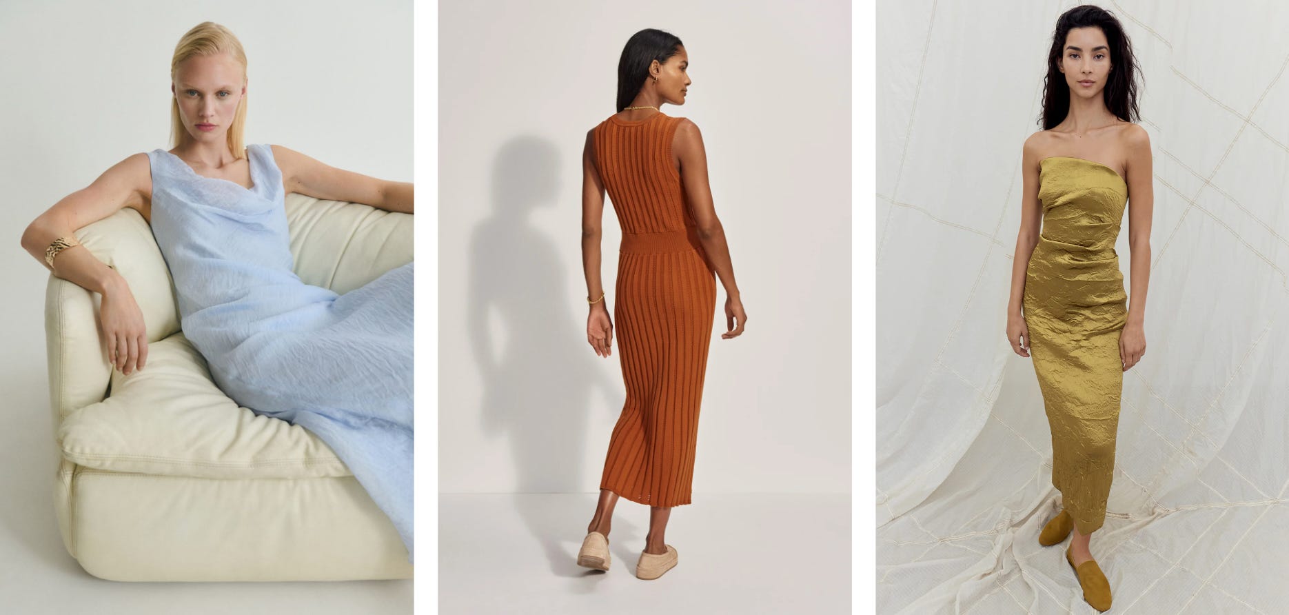
“Color levers” are my attempt to talk more objectively about color in clothing. This is my thesis: color expression in clothes can vary along several different dimensions at the same time. By pulling apart these different axes, or “levers”, you can better recognize your preferences for color and articulate the particulars of your taste. Below, the four levers I’ve identified so far, illustrated with things I’ve seen and liked lately.
Hue variations
Every “color” has a million different variants. Are you all in on butter yellow or would you rather meyer lemon? Are you team moss green or more avocado? By being attuned to the nuances within color families (this section on the Sherwin-Williams site is such fun inspo), you can start identifying more specifically what you like and don’t.
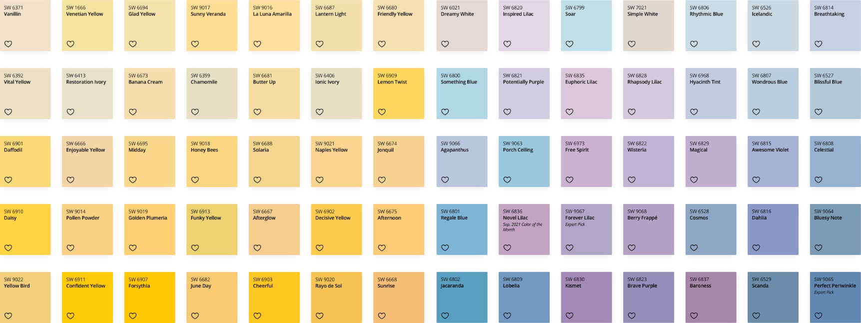
Relatedly:
’s fun post on “LaCroix” colors in fashion is a great example of an affinity for specific hue variants. She writes:I started to clock “hint of” shades EVERYWHERE; a subtle suggestion of color rather than an overt decree. I realized…fashion has gone the way of LaCroix!
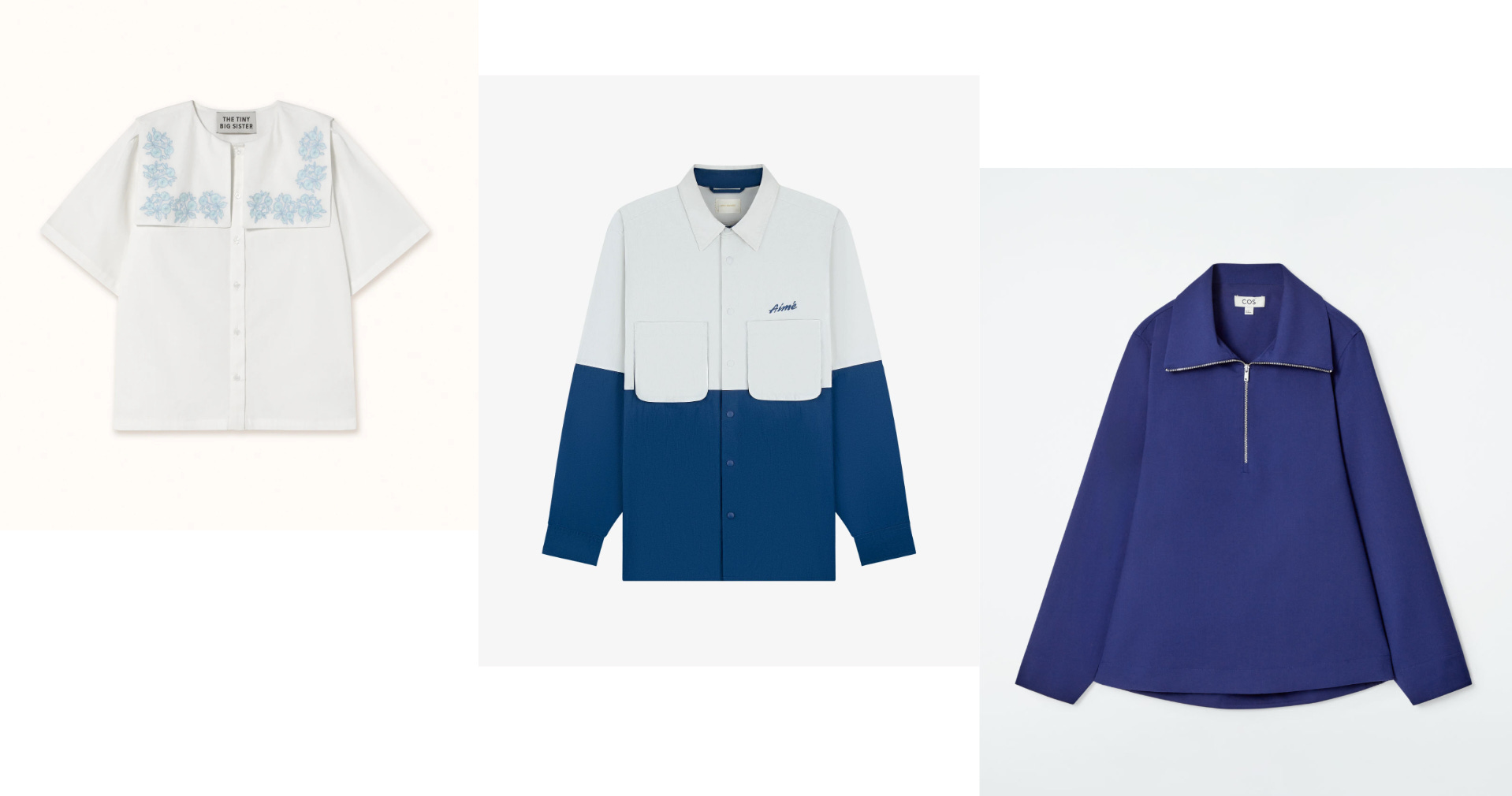
Coverage
When looking at a garment, take note of how much surface area color is taking up. Is it literally the whole shirt? Just the pocket or collars? In the stripes that run up and down, left and right? Consider whether that level of coverage feels like too much for you—or maybe just right.
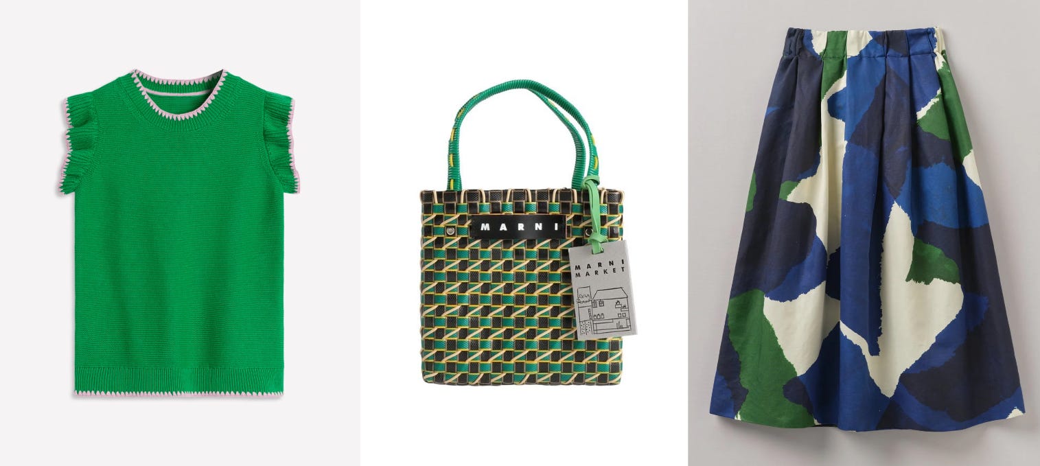
Concentration
This is about the existence and impact of multiple colors, i.e. if there is a primary color, are there other colors at play that dial it up or tone it down? If a dress is mainly bright pink florals, are those flowers surrounded by smaller greenery? Is there also a light blue backdrop to everything? Concentration is about noticing how multiple colors interact. A simple practical consideration flows from this thought: the more colors present in a piece, the more opportunity to pair it with other colorful pieces whether to complement or contrast.
Texture & materiality
The last lever is kind of a combo because there are plenty of miscellaneous factors that could affect the actual experience of color. The main idea is to notice to what degree the texture and material alters or “bends” the color of the piece.
This could be about opacity. At one end of the spectrum, we have the more “matte” materials and finishes like sweats and denim, which feel dense and full color. On the other end, we have more translucent materials like mesh or organza that let in more light and colors from other layers.
This could also be about luster and sheen. The appearance of shinier materials and finishes like silks, satins, and patent leather will shift with light and angles. You can also pay attention to this in the hardware—a bright red sweater is going to feel very different with matte black buttons vs. pearlescent or gold.
Now that you know what I consider to be color levers, let’s use them to do a case study on the reds in my wardrobe :)

CASE STUDY: RED IN MY CLOSET
There’s not a ton of red in my closet, but the red pieces I do have, I absolutely love.
Exhibit A: Banana Republic dress (aka my wedding season MVP)
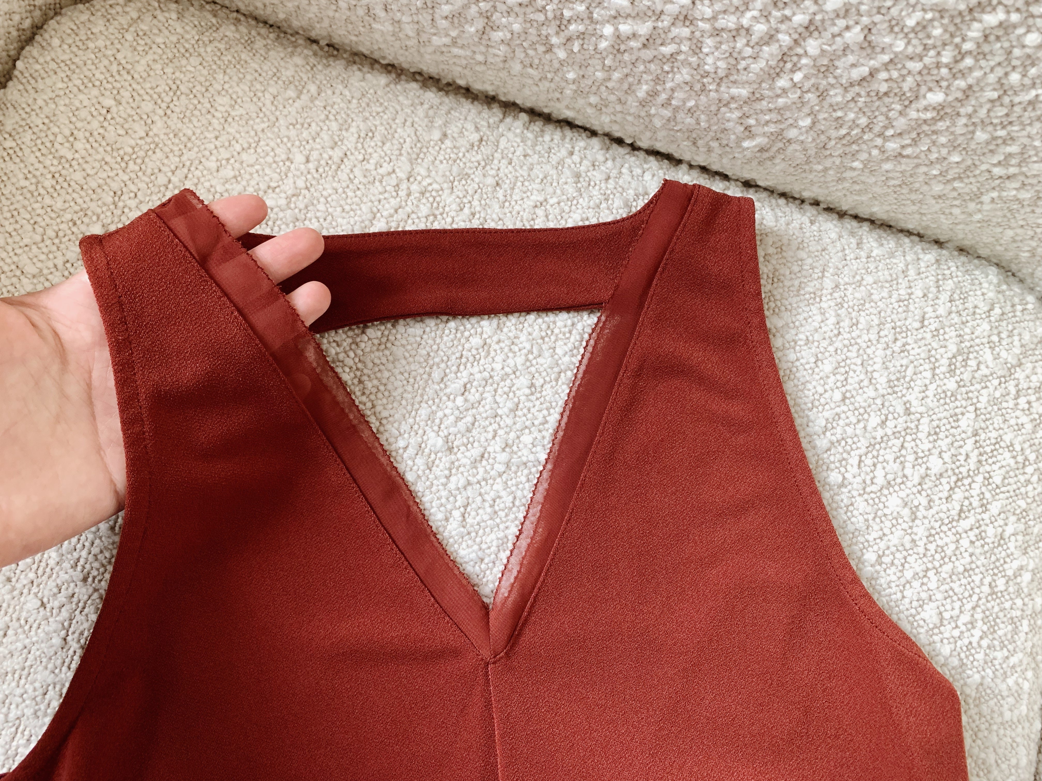
Key levers: Hue variant and texture/materiality
This solid dress is toned down through the more understated, earthy shade of red and a grainy matte material (this would be a very different dress in satin!). Bonus textural detail: the diaphanous trim on the neckline.
Exhibit B: Opening Ceremony x Coca Cola t-shirt
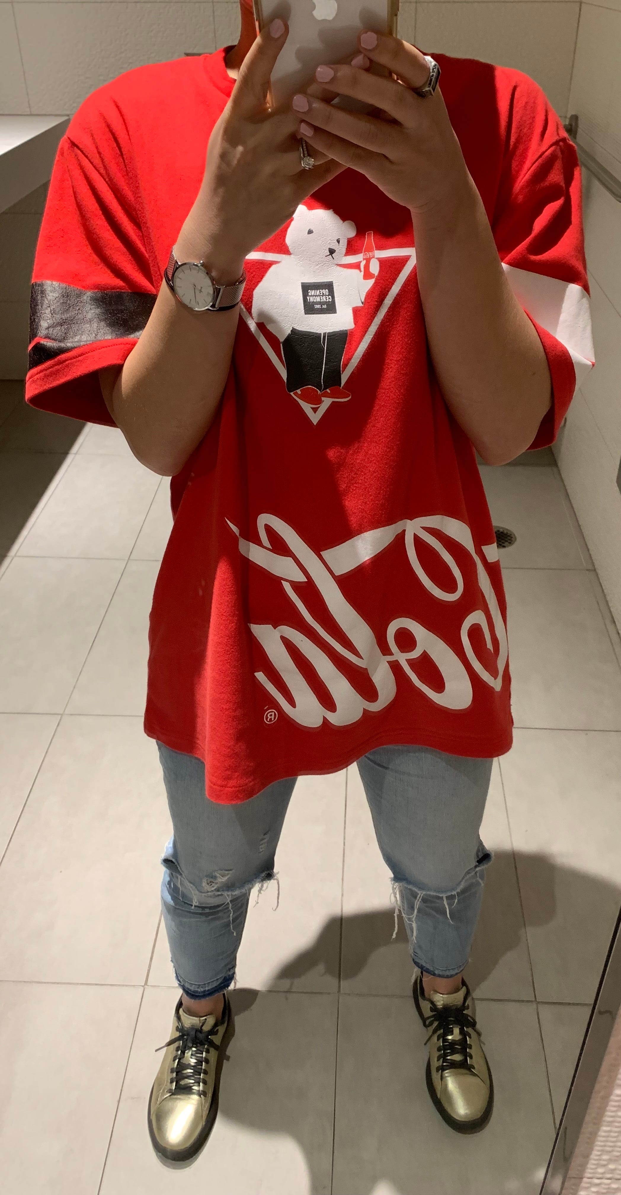
Key levers: Coverage and concentration
Gosh, this is a really freakin’ vivid red. While I respect it as a color, it would be way too much for me if it weren’t for all the black/white elements. It might not even work for me if it were a more regular black/white pattern. But no, in this case, the graphics are so random and all over the place (A bear! The Coca Cola wordmark! Bands on the sleeves!), which really help break up the red in a visually exciting way.
Exhibit C: Sandro dress
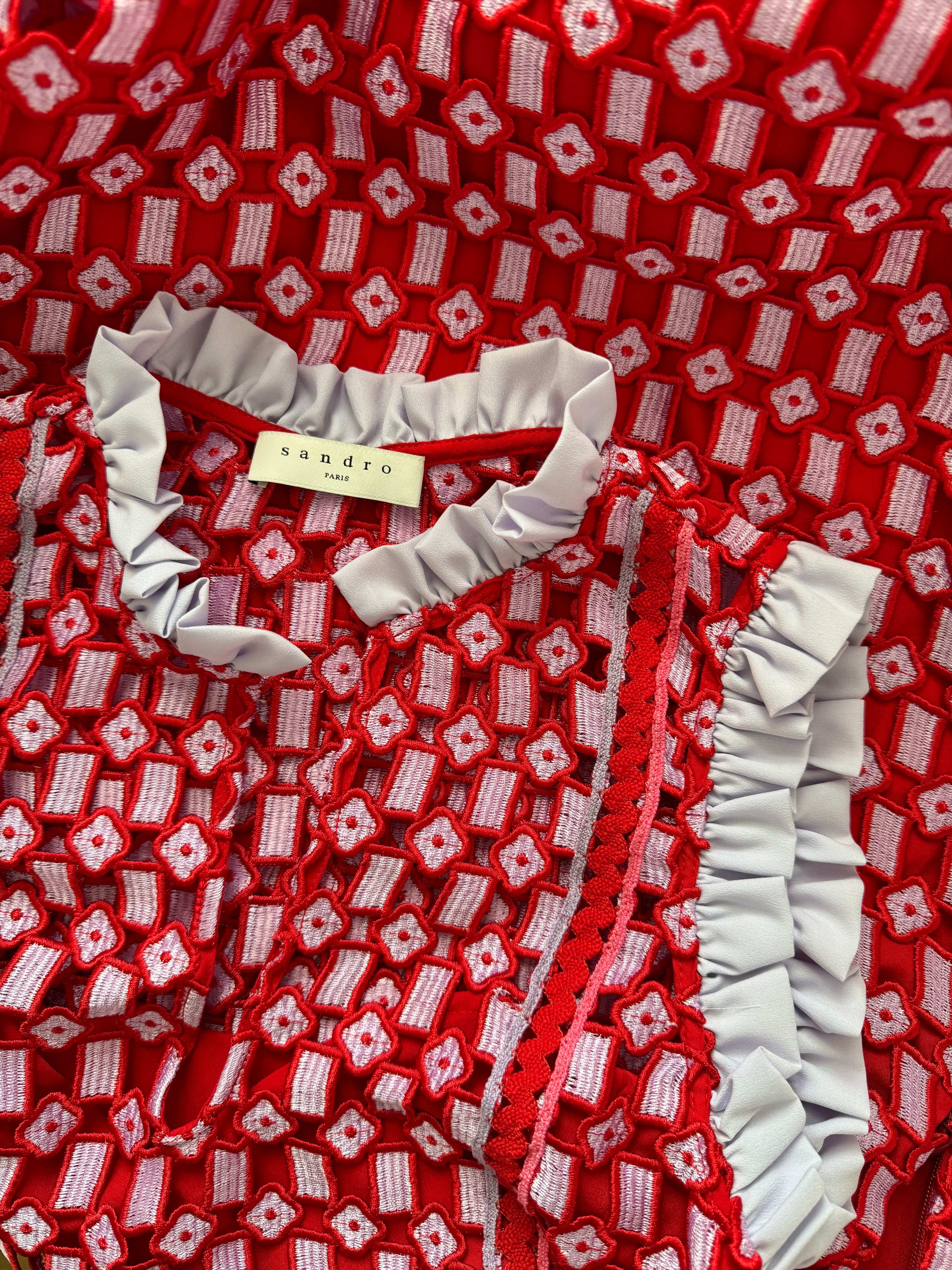
Key levers: Concentration and texture/materiality
This was my wedding reception dress, which I’d always expected to be red, per Chinese tradition. I encountered it in my size, on sale, at the Bloomingdale’s on 59th, and as I walked into the fitting room and put it on, it truly felt like divine intervention.
Though this piece definitely comes off as a red dress, it’s almost as much about the beautiful pale lavender, seen throughout the embroidered motifs and the ruffle trim on the collar and armholes. The motifs-and-cutouts overlay on a solid red lining literally gives the whole piece an extra dimension—and, fittingly, also reminds me of traditional Chinese carved wooden door panels!
Frankly, I’ve only worn this dress twice (the second time for my 30th birthday), but you bet I’ll be holding onto it forever if only to admire it up close once in a while.

To develop taste is to understand your taste
These color levers provide just a few lenses through which you can judge a piece of clothing’s color expression and tease out how you feel about it. While shopping or getting dressed, try to start noticing and identifying specifically why the color in the piece is or isn’t working for you.
Why is this important?
Being able to pinpoint why you like or don’t like something helps build confidence in your taste. It gives you conviction to be pickier, to only bring into your closet pieces you really truly connect with and will be excited to wear and style for a long time.
Sending good color vibes to your closets,
Jenny
WHAT ELSE IS ON MY MIND…
The baby favorites list I’ve been piecing together for like a year is finally up! I put this one out as web-only (no newsletter) because I envisioned it as an old fashioned blog post that I’ll try to update a few times a year. Hope it’s helpful if you’re in the midst of baby prep and feel free to share with friends!
While spring cleaning recently, I ended up “shopping” from a pile of previously decluttered items marked for resale or donation. The three pieces I saved are all cropped-ish shirts that I stopped wearing in recent years, probably starting with pregnancy. But looking at them again, I realized that 1) I’m still excited about them (what is it about fun stripes…) and 2) a few high-waisted bottoms I added in the past year could help me wear them more! Details on all this below, including how color levers come into play and some outfit planning via Indyx ;)