

The case for dressing by color
Color is fluid. Color is limitless. Color is personal.


Sometimes when you go get dressed in the morning, you know exactly what you want to wear. Your favorite sundress. A new linen set. An oversized tee that will cover up your bike shorts just right. Those are the easy days. But what about all the other times, all the nothing-to-wear moments that come around way too often 😩? How can you still get dressed with intention?
In my personal experience working with a relatively lean closet over the years, the approach that has helped me feel the most inspired day to day is dressing by color, by which I mean getting dressed with color as a starting point and a north star. It’s simply about asking:
What color(s) do I want to wear today?
If you’re interested in buying less and wearing more of what you already have, I think there are a few really valuable benefits of focusing on color when getting dressed, and especially when you’re feeling stuck. I believe this approach:
Requires less clothing to compose a variety of outfits — because color gives each piece a simplified level of modularity, you can just focus on putting together color combinations that feel good to you and worry less about other more externally-driven factors like “Is this style still cool?”... “Have I worn this piece too much lately and does that make me boring?”... You know, the kind of questions that make you feel like you need to buy some new stuff. Even “outfit repeating” becomes more flexible with color: It’s not so much about wearing the same pieces again and again as it’s about using them to create different color stories. (You’ll see a lot of the same pieces in my photos in this post and that’s definitely the point!)
Allows you to express yourself apart from brands and trends — rather than signaling something about yourself through logos, trending silhouettes/styling, or the sheer novelty of newly purchased clothes, you’ll instead tell the world what you like and how you’re feeling through color.
I’m sure everyone thinks about color to some degree already when getting dressed, but I believe going color-first is an easy perspective shift to start seeing your closet more holistically. Dressing by color means opening your closet and seeing a closet full of fluid pieces that can rearrange to serve many looks and occasions instead of rigid pieces that are tied to a couple of specific outfits.
Now, let’s get into some nitty gritty of how I approach wearing color…

My color scheming principles
Color helps put the personal in personal style: We might not all agree all the time on what combos look the best together but I truly believe that at the end of the day, it’s your own opinion that matters. Below, I’m sharing some of my personal color opinions and tricks — and then in the next section I have some suggestions for how to develop your own color preferences and point of view.
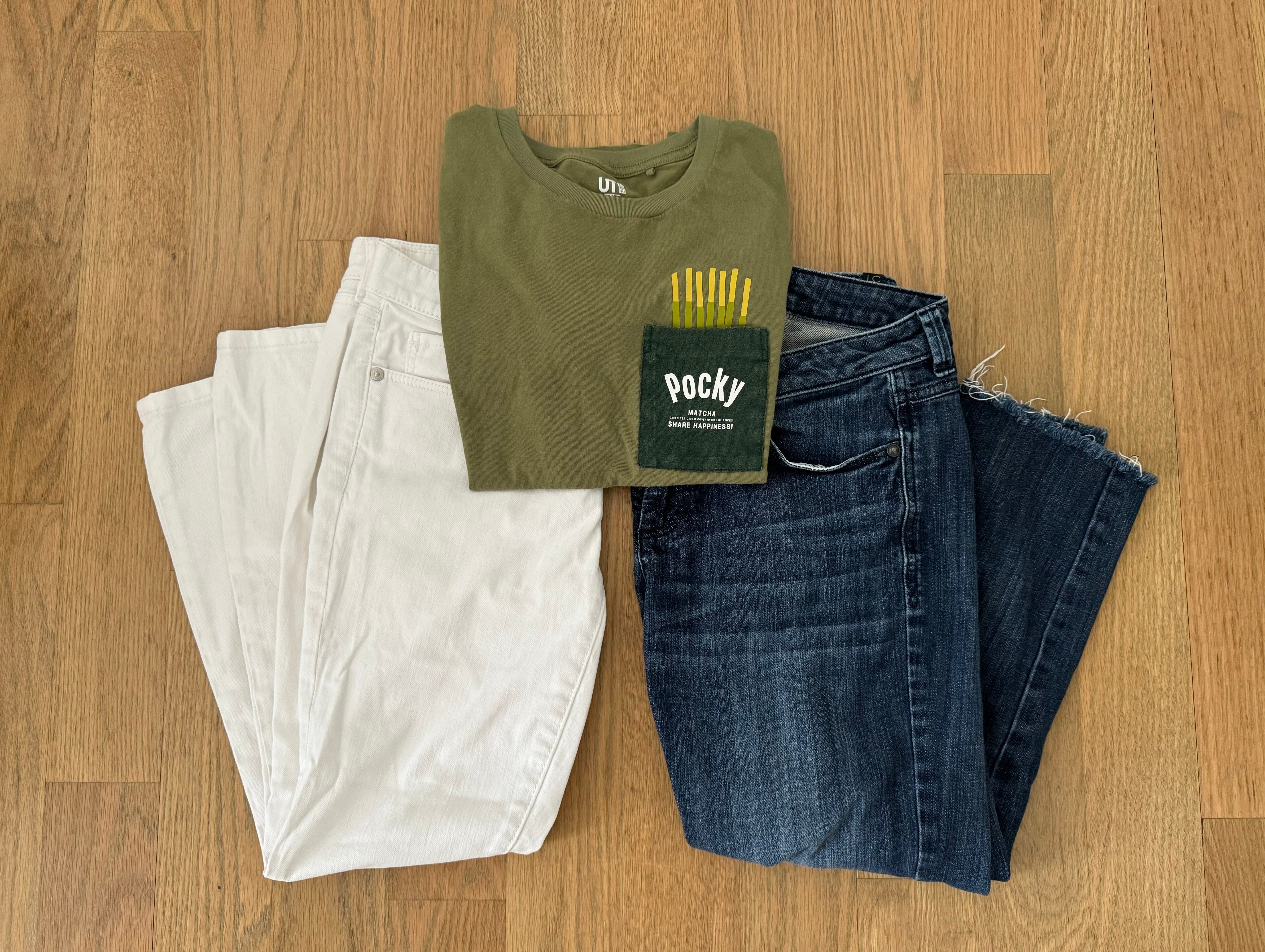
Use white to put a colorful piece center stage.
An easy way to make one colorful piece shine is to pair it with something white. I typically do this with a brighter top and white jeans. The white jeans make the colorful top even more crisp and vibrant, like white borders around a photograph. Or like a white cube gallery effect.
Here’s the Tate on the white cube:
With an emphasis on colour and light, artists from groups like De Stijl and the Bauhaus preferred to exhibit their works against white walls in order to minimise distraction.
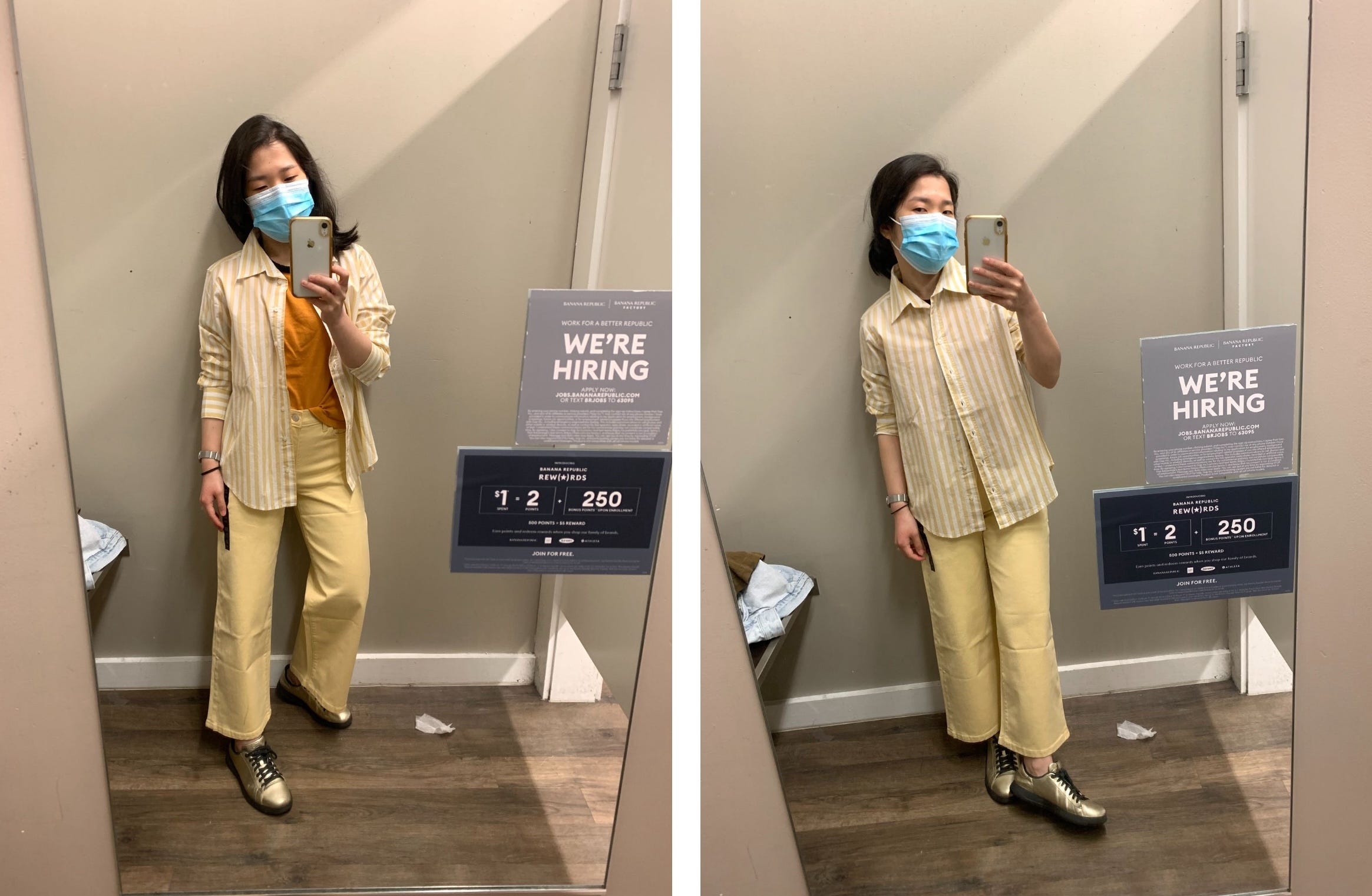
Go monochrome-ish.
By “ish” I mean the pieces are generally the same color, but not an exact match, aka tonal. Even better if one piece has a pattern or distinct texture. If this kind of outfit were poetry, it would be like a slant rhyme. Kind of rhymes, but makes you think about it for a second.
When in doubt, look to nature.
This is my favorite color-scheming trick. The sunset, flowers, a butterfly. My philosophy is: If it exists in nature, it’s natural, it’s beautiful, and you can make the color combo work for an outfit. I think this also applies when shopping for new items — if a color feels natural and beautiful in a way that reminds you of things you’re attracted to in nature, you’ll probably feel good about having it in your closet! Some nature inspo I love:


Ready-made nature color palettes — nifty!
The Josep Font era of Delpozo.


Take note of personal favorite combos to repeat.
As you explore and experiment with different combos, take note of what you like — what makes you happy, confident, etc. My favorites:
Pink and green
Pink and yellow
Yellow and lavender
Yellow and bright blue

(High-five ! Who was also inspired by pink and green recently…)
P.S. A color scheme that is maybe a new favorite for me: Pink1 and orange…
… “Sorbet” to me, “highlighter era” to Olympia Gayot!

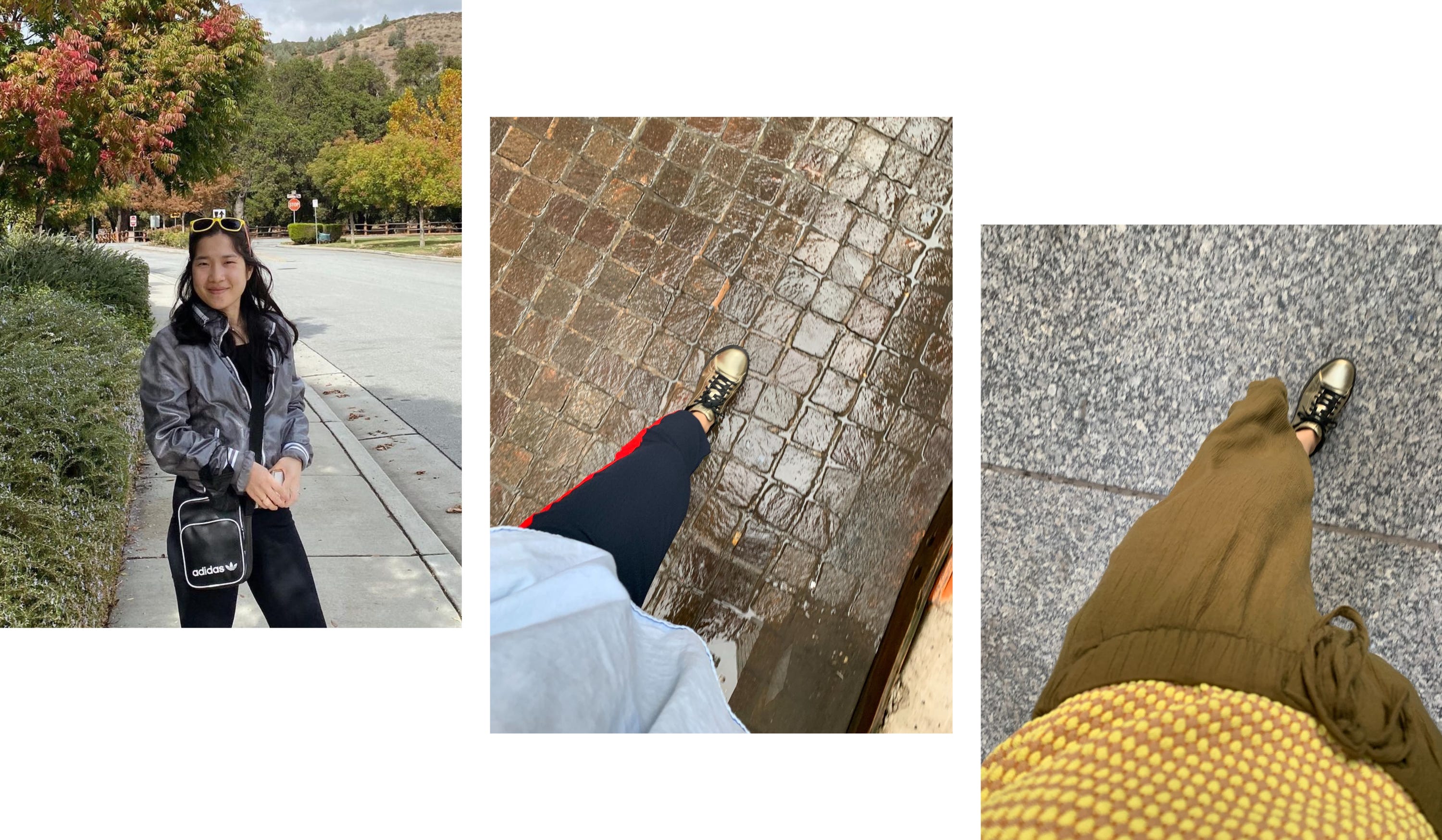
Metallics are both a (shiny) neutral and a (subtle) color.
Which makes them so fun and useful to have. It’s often hard to say if the piece is serving as a neutral or a color but it’s just a nice thing to throw in the mix, adding some extra shine and vibrance without screaming “color”. In my closet, these are the gold sneakers and a silver-ish windbreaker.
There are “maximum color expressions” for every outfit. Have fun trying to find them.
You start out with one colorful piece, and then you just keep asking: What other color will be interesting to add? Each time you ask this you’re considering whether the addition will complement or contrast with what’s already there. The end goal is feeling like you’re doing the absolute most but somehow still appearing nice and balanced. Like you’ve stretched the limits of color possibilities in your closet through just that one outfit. I think a similar idea can be found in
/ Creative Pragmatism’s “One/Ton/None” approach to wearing color, where the “Ton” route involves “a full flood of colors” that ironically “creates calm”.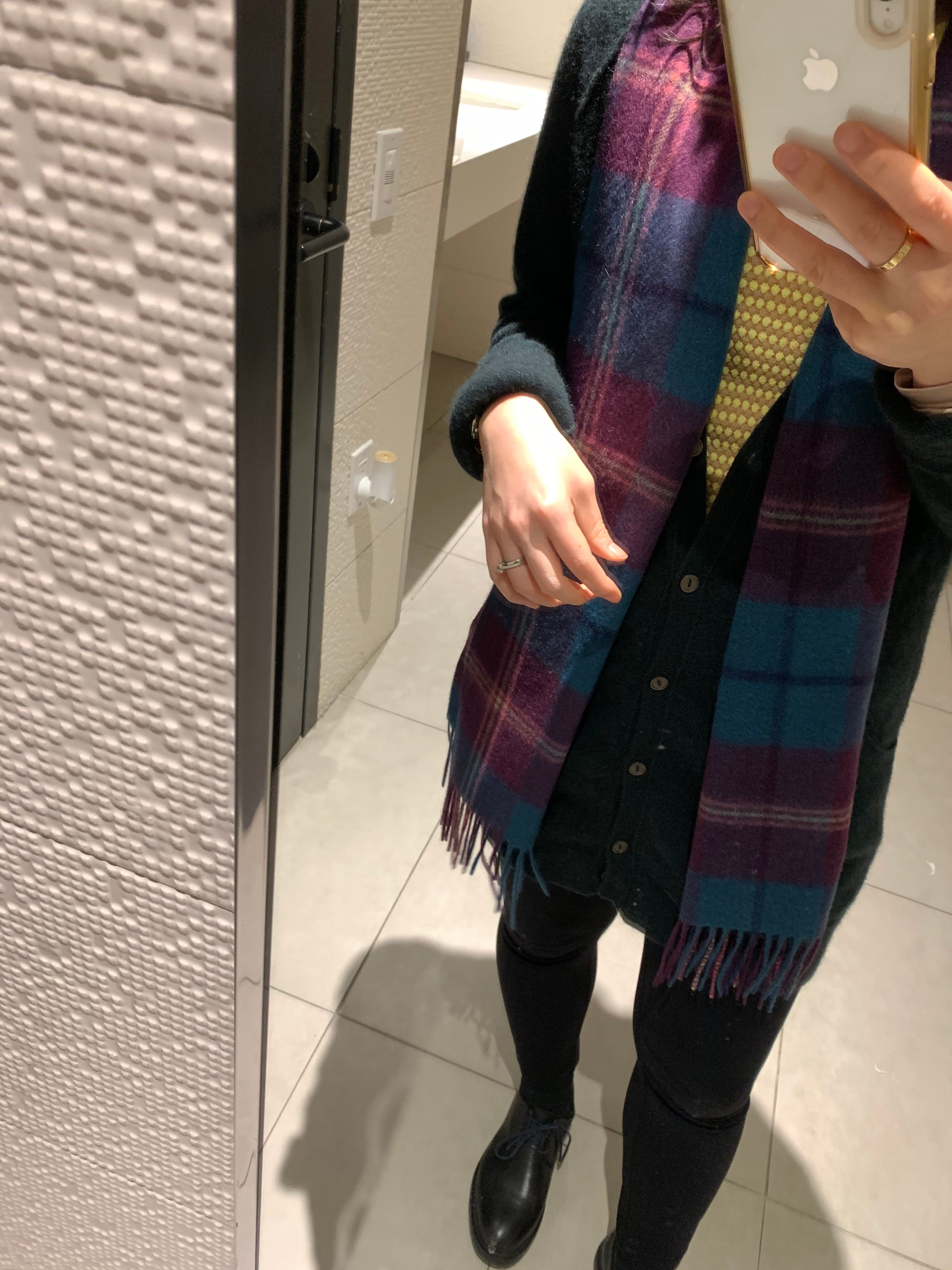
It was fun to stumble upon some Color Maximalism from
in my feed!
Where to find color inspiration
Here’s the cool thing about dressing by color: The more colors and color combos you can appreciate, the more styling options become available to you when you go to your closet or out to shop. The more exposure you have, the more you can hone intuition and opinions about what colors look and feel good together — not just general color combinations, but specific shades or even specific shades in specific materials.
As I mentioned, nature is my top favorite inspo, but what else? Here are some other ideas:
Look at menswear… I love looking at work from brands like Aime Leon Dore and Todd Snyder, and following looks from Kenneth Sylvester on Instagram. My hunch is that because menswear silhouettes are more limited, the designers really have to do more with color and texture.


Look at resortwear… Vacations feel vibrant by default, so brands closely associated with going on holiday are usually pretty good at color. For example, I enjoy looking at Johanna Ortiz and the travel-minded curations at Holiday Street.
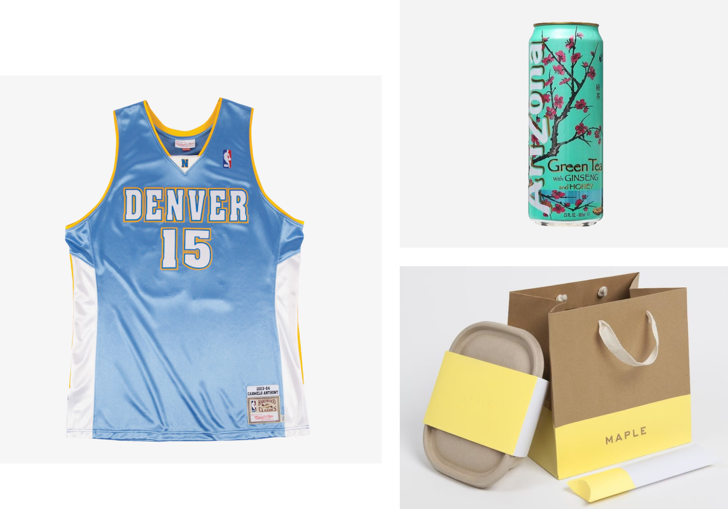
Look for memorable pop culture iconography… This is how I think about it: Somebody at some point went through the painstaking process — multiple layers of approvals and all that — to develop, validate, and finalize a color pairing for whatever entity they’re designing for, so it probably pops in a good way. Pay attention to the color schemes you respond to positively while out and about. Examples that are always floating in my brain: the powder blue and marigold Denver Nuggets uniforms from the 2000s. Similar but a bit different: The Swedish flag. The magenta and teal of Arizona iced tea. Maple food delivery bags circa lunchtime Manhattan in 2015. These to me are pleasantly familiar color combos that I’d be excited about translating into outfits.
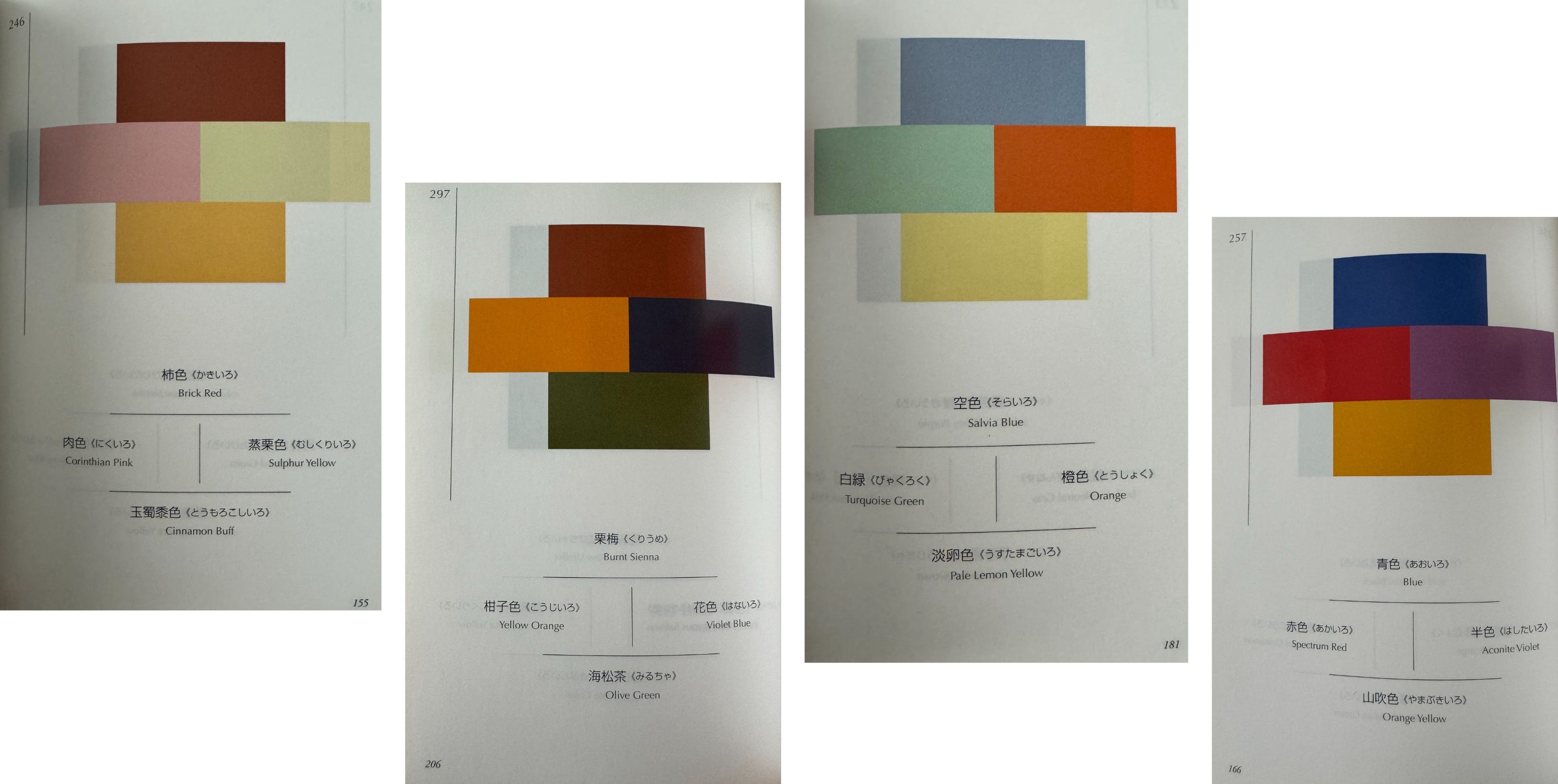
Look at color books… My two favorites to casually flip through are: Interaction of Color by Josef Albers and Sanzo Wada’s Dictionary of Color Combinations. They’re great for getting the color scheming juices flowing and challenging my perceptions.
(Bonus: ’s “Outfits & Interiors” series is so brilliant and fun to look at!)

Learning from Dries
To close out this post, I wanted to share one of my favorite quotes on color and style. It’s what Hanya Yanagihara wrote about Dries Van Noten in T magazine in 2017. I think it does a great job conveying how appreciating the intricacies and interplay of color can be endlessly exciting.

Van Noten’s great gift is color. No living designer understands it as well as he does; no other designer has such a rich vocabulary of tone and hue that certain shades, once seen, are impossible to associate with anything other than his clothes. Dior may have had his New Look; Van Noten has a particular blue: brighter than indigo, blacker than a cornflower, deeper than the Pacific. There is also a Dries Van Noten yellow (a rich, yolky marigold); a Dries Van Noten green (the gleaming, dense color of an emerald placed on a square of dark velvet); a Dries Van Noten red (cinnabar-ish and slightly chalky) and a Dries Van Noten purple (a dusty eggplant). But it’s not just the colors themselves that make Van Noten’s clothes so memorable, so resonant; it’s what he does with them, forcing them into strange relationships and juxtapositions that, if you encountered them only as words — persimmon and seashell; compost and moss — might sound unlikely, even occasionally unpleasant. In reality, though, the couplings are revelatory, so effortless that they ask you to reassess the limited way we’ve been encouraged to see color in the first place — why, after all, can’t iris purple pair with camel? Why can’t dulce de leche brown coexist with kelp blue?
Open your eyes to all the color possibilities! There’s so much to play with.
🙏🎨💌 Thanks so much for reading (especially if you made it all the way down here)! I’d love to know what you think. Agree? Disagree? How do you approach wearing color? Please share your thoughts in a comment or DM!
If you’d like to give my writing some extra support, I’d be very grateful :)
As I’m writing this, I’m realizing these pastel pink ruffle-waist culottes from Uniqlo ($14.90, bought in March 2018, according to my Wardrobe Tracker) are doing a lot for me. Works with everything! And you know what, only when I was trying to find them on Poshmark just now did I remember that they were actually from the Girls section haha (there is one listing)! Perennial petite hack: Check the kids section at high street places. I’ve also had a few kids section winners from Zara.
Loving your feed, J Star. Just found it and fangirling
Pink and green is also a favourite combo of mine! You've definitely found your colors (especially the purple!) - those palettes communicate a playful element to your style.